Law Firm Website Design: 6 Examples and What Makes Them Work
Law firm website design examples in six styles, what a lawyer’s homepage needs on the first screen, and how to match a design to your practice area.
- Updated
- Reading time
- 4 min
Good law firm website design tells a prospective client what you handle, where you practice and how to reach you, in a style that fits the kind of law you do.
What makes good law firm website design?
A person looking for a lawyer usually has a problem and limited patience. Clear words on the first screen matter more than the visual style, and a phone is the likeliest place they’ll read them. Stock photos of gavels and courthouse columns take up that space and say nothing about you.
The first screen
What a law firm homepage should show right away
- 1The practice and the place“Family law attorney in Brooklyn” tells a visitor and a search engine more than a slogan about justice.
- 2A way to request a consultationOne clear button, with a short note on what happens after someone sends the form.
- 3A tappable phone numberPeople with an urgent legal problem often want to call straight away.
- 4The lawyer’s faceA real photo near the top, with bar admissions and experience in the profile.
6 law firm website design examples
All six are homepage concepts from our design gallery, drawn for firms of different kinds. They’re concepts and not client sites, so read them as style references. The firm names are invented.
Concept designs
Law firm website design examples from our gallery
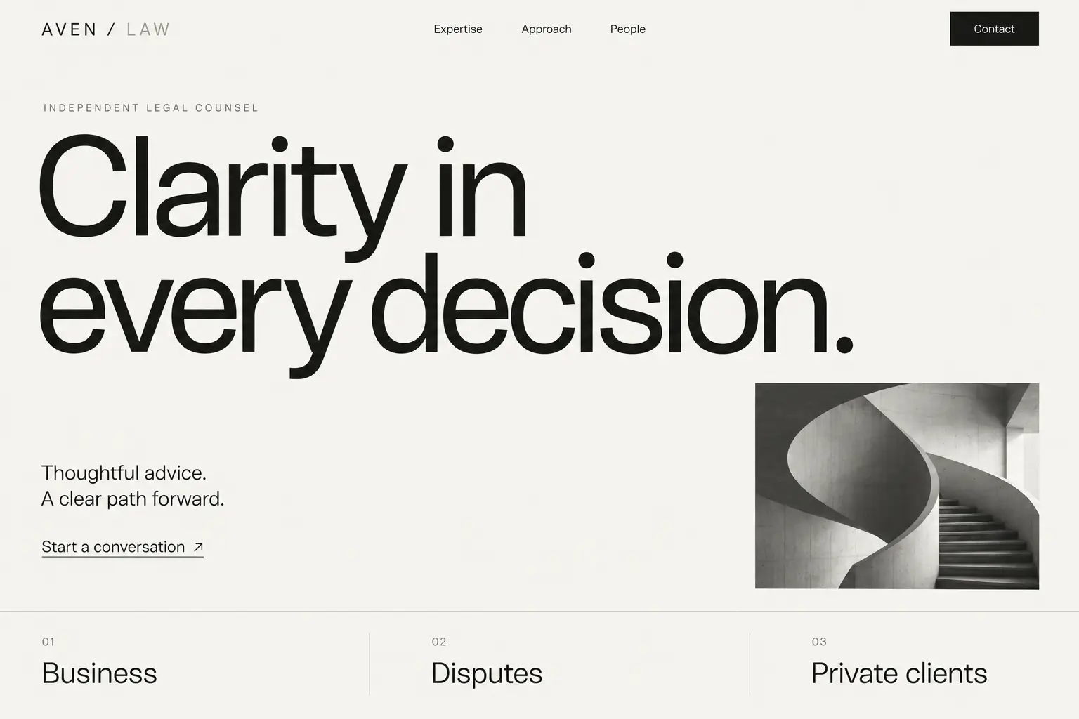 Aven LawQuiet, spacious minimalism
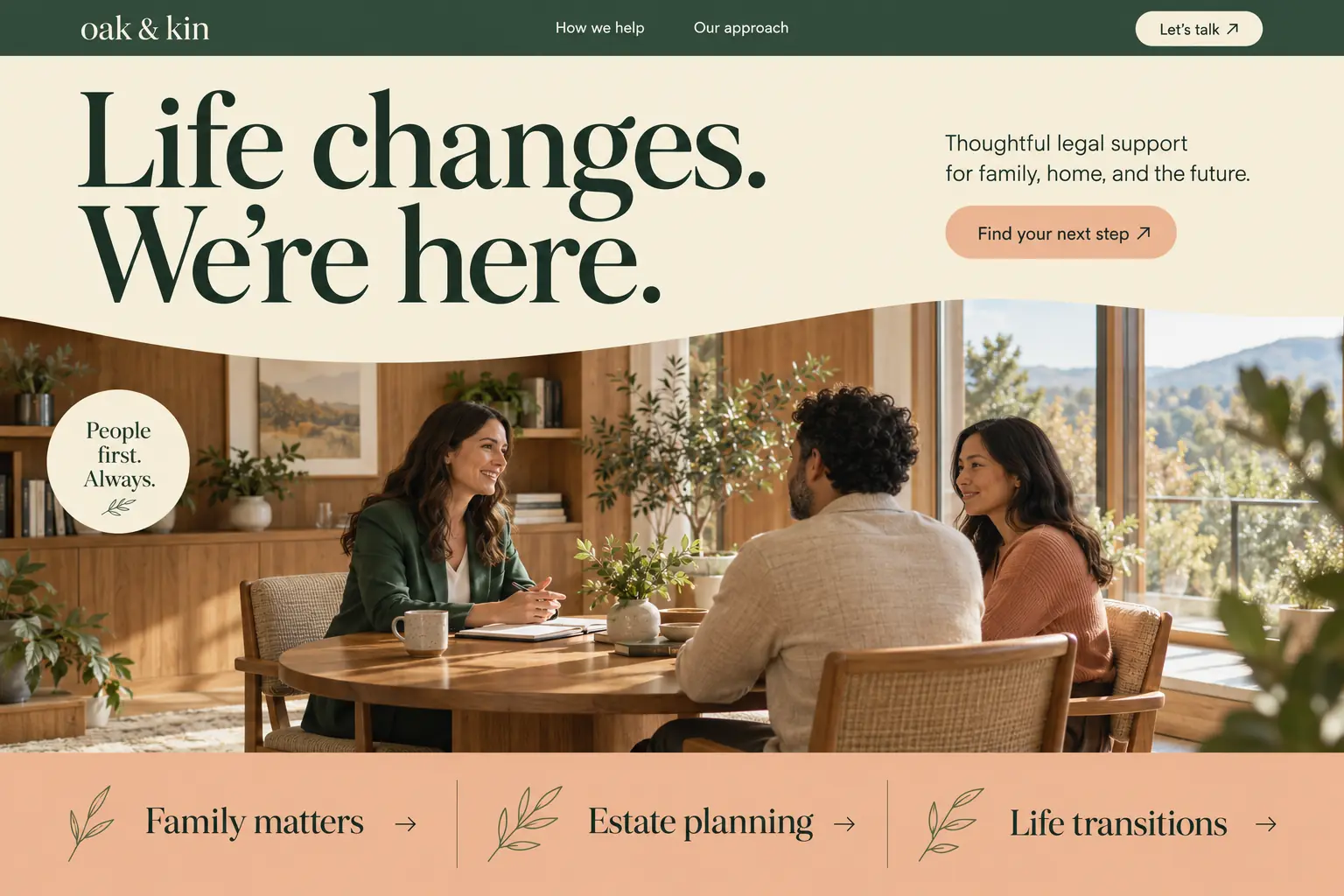 Oak & KinWarm, organic, approachable
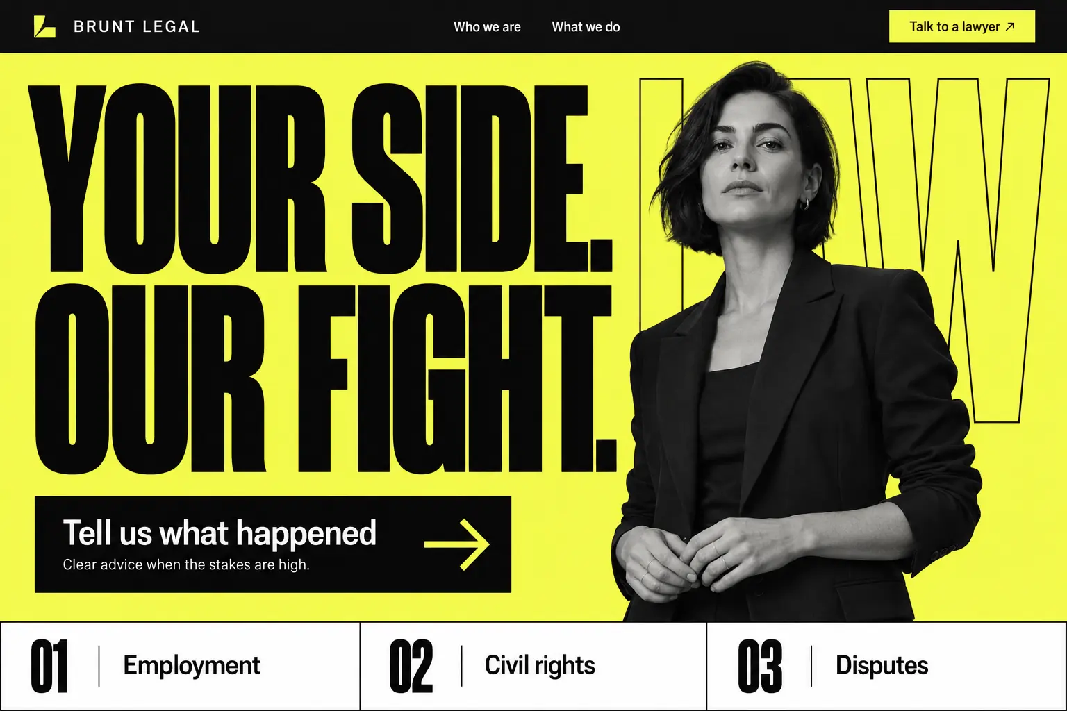 Brunt LegalBold typography, acid yellow
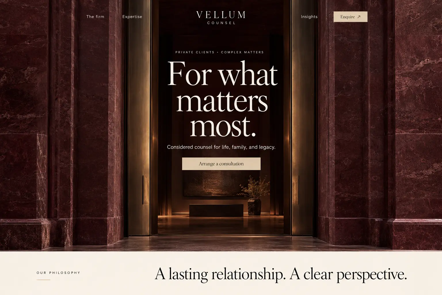 Vellum CounselBurgundy and champagne luxury
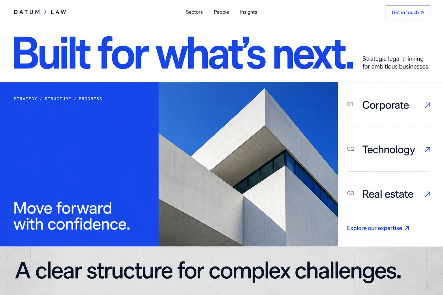 Datum LawCobalt architectural modernism
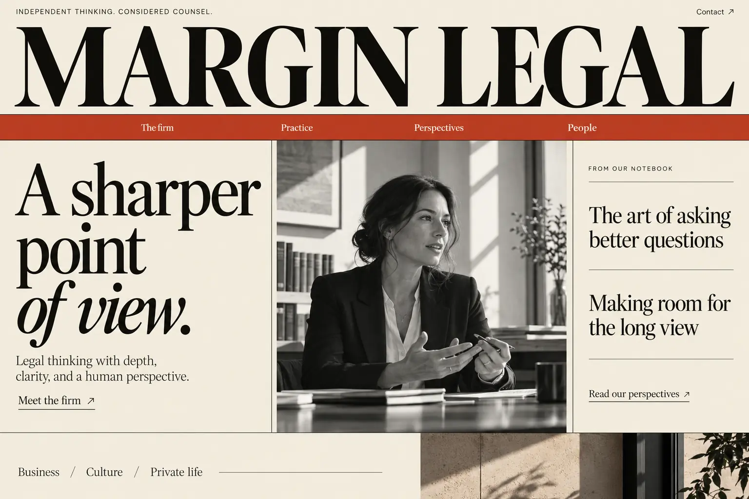 Margin LegalEditorial magazine aesthetic
Aven Law has the most restraint of the group: white space, one sans serif and a single small photo. It would suit a firm that wants to look modern and unhurried. Oak & Kin goes warmer and would work well for a family or estate practice, while Brunt Legal’s oversized black capitals on acid yellow are built for a firm that wants to come across as a fighter. Vellum Counsel’s burgundy and champagne suit a private-client practice, Datum Law’s cobalt and concrete feel corporate, and Margin Legal borrows from magazine layouts, which would help a firm that publishes a lot.
How to match the design to your practice
Family law and estate planning
Warm and calm. People arrive during a hard time, so plain language and a real photo do more than marble and columns.
Personal injury and criminal defense
Direct and high contrast. The visitor is often in a hurry, so the phone number and the practice area should appear at once.
Corporate and business law
Precise and restrained. Readers are comparing firms, and they’ll look for experience, industries and named attorneys.
Private client and wealth
Quiet and premium. Fewer words and more space suit a smaller audience that mostly arrives through referrals.
These are starting points from our own design judgment. Test them against your actual clients. A bold personal injury style can work for a family lawyer whose clients want someone in their corner, and your colleagues’ taste matters less than theirs.
Law firm website design mistakes to avoid
One frequent mistake is listing every practice area you could possibly take, which makes a firm look unfocused and gives no page a clear job. Others are contact forms that invite confidential case details, outdated attorney bios, and no visible phone number on mobile. Autoplaying video and long intro animations also hurt, since they delay the only thing most visitors want to read. For a wider set of failures, see these bad examples of websites.
Where to start with your own firm’s website
Our law firm website design service starts with one of these directions, or a mix. A single fast page is a flat $1,000, usually live in 5 to 7 days, with hosting and care at $5 a month. Firms with an existing site should read our guide to a lawyer website redesign first, because pages that rank today need a plan. You can compare budgets in what a law firm website costs.
Frequently asked questions
- What should a law firm website include?
- Your practice areas in plain words, where you practice, attorney profiles with real photos and bar admissions, a clear way to request a consultation, a tappable phone number, and any disclaimers your state requires.
- What colors work best for a law firm website?
- No color is proven best. Navy and dark tones signal tradition, warm neutrals feel approachable, and strong contrast suits an assertive practice. Choose what fits your clients, and make sure the text stays easy to read.
- Should a law firm website show case results?
- Only if your state’s advertising rules allow them, and with any required disclaimers. Results can mislead readers about what to expect, so have the firm review that wording before it goes live.
Work with PageSimple
Pick a direction. We’ll build it.
Tell us about your practice and which concept feels closest. If you have a site today, share the address so we can see what’s worth keeping.